The Maison · 4 min read
The New Collar Capsule: Ten Color Studies, One Clear Standard
The design notes behind a new series of decorative collars in faceted glass, pearl-finish detail, and clear boundaries for supervised wear.
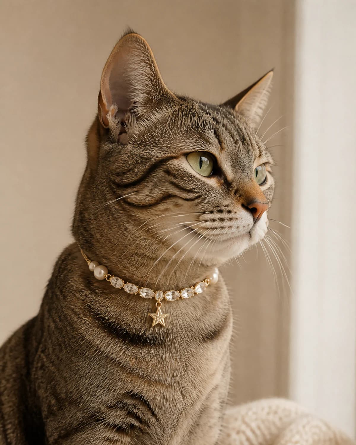
Begin with a color story
The new capsule begins with ten distinct palettes: ivory light, bellflower blue, rosewater pink, deep green, saffron gold, twilight gray, pearl, coral, silver, and velvet ruby. Each name describes the visual direction of the piece; it is not a mineral, therapeutic, or behavioral claim.
The result is a collection that gives a pet's coat room to lead. A bright collar can sharpen a pale portrait, while a deeper color can bring definition to a lighter setting without turning the accessory into a costume.
Keep the silhouette easy to read
Faceted glass, pearl-finish detail, gold-tone hardware, and an adjustable closure create the visual language of the capsule. The proportions are intentionally clear in a photograph, so the collar reads as a finished detail rather than a crowded layer.
That same clarity matters in the product page. Every new piece is shown on its own, then in a consistent cat or dog styling view so the scale and placement are easier to judge before choosing a size.
Decorative by design
These are decorative accessories for supervised moments. Check the fit before every use, leave room for comfortable movement, and remove the piece for sleep, rough play, water, travel in a crate, or any unsupervised period.
For walks and everyday identification, use the appropriate safety collar or harness separately. A beautiful accessory should add to a moment without being asked to do a practical job it was not designed for.
Choose the moment first
A portrait, a quiet visit, a birthday, or a new-home photograph can all give a special piece a natural place in the day. Start with the coat, the light, and the temperament of the companion, then choose the color that leaves them as the focal point.
The full capsule is also available in Styling Studio, where the same cat and dog references make it easier to compare color and proportion before adding a piece to the edit.
Continue reading